← All Work

05 · 2025

Twilio

Bringing the marketing voice and the product experience into one system.

Client
Twilio × SCADPro
Role
Design Management
Focus
Messaging, Copywriting, Marketing Strategy
Duration
Mar to Jun 2025 · 4 months
Location
Atlanta, Georgia
Disciplines
Brand Strategy, Marketing, UX Alignment

Overview

Twilio's platform sits between developers and end users, and its brand voice has to hold up across both audiences. My SCADPro team was invited in to audit, rethink, and rebuild pieces of that experience, from onboarding through daily use.

I stepped into the Design Management role, leading a marketing team that was focused on messaging, copywriting, and brand strategy. My core job was the connective tissue between the marketing voice and the product surface, so that when the UX team redesigned a screen, the language and visual system moved with it.

My Role

Bridging brand strategy and product experience.

I led the marketing team on staying on brand and connected that work directly to the UX team as they rebuilt user flows. In practice, that meant sitting at every crossover moment where copy, product language, and interface decisions needed to line up.

  • Conducted brand audits and competitive analysis to identify gaps in consistency and positioning.
  • Partnered with designers and researchers to develop a more scalable, cohesive brand framework.
  • Contributed to improving internal design workflows and system alignment, supporting more consistent user experiences.
  • Translated research insights into clear design recommendations, bridging strategy and execution.
The Foundation

Audit first. Frame second. Ship third.

We started with a hard look at where Twilio's product surface and its marketing voice were drifting apart. That audit surfaced three consistent gaps: language that didn't match tone across surfaces, visual system fragments that didn't scale, and onboarding copy that didn't set expectations for the product beneath it.

From there, the team built a scalable brand framework the design and marketing teams could share. Not a style guide sitting in a folder, but a working system that made tomorrow's decisions faster.

Reimagined Screens

Before and after, across four core surfaces.

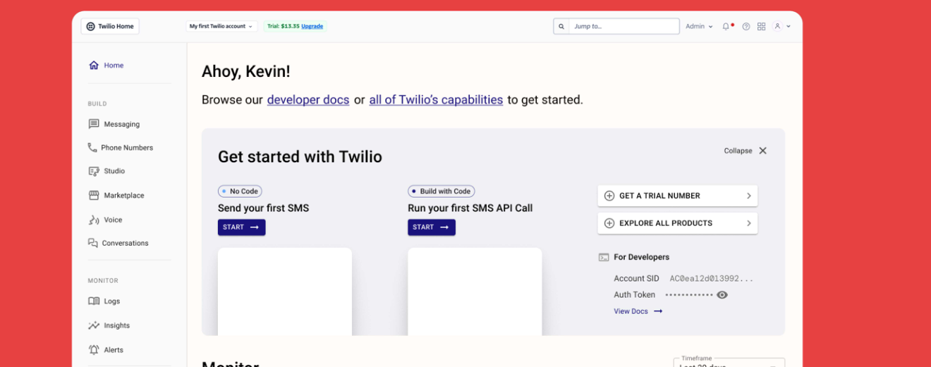
The UX team led the interface redesign; my team held the language and brand rails through every version. Four of the highest traffic surfaces before and after the rework.
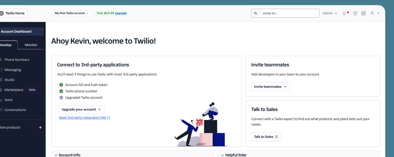
Twilio dashboard, existing version
01 · Dashboard, before. The original home offered a lot of information but no clear hierarchy or call to action for new users. Confusing on arrival.
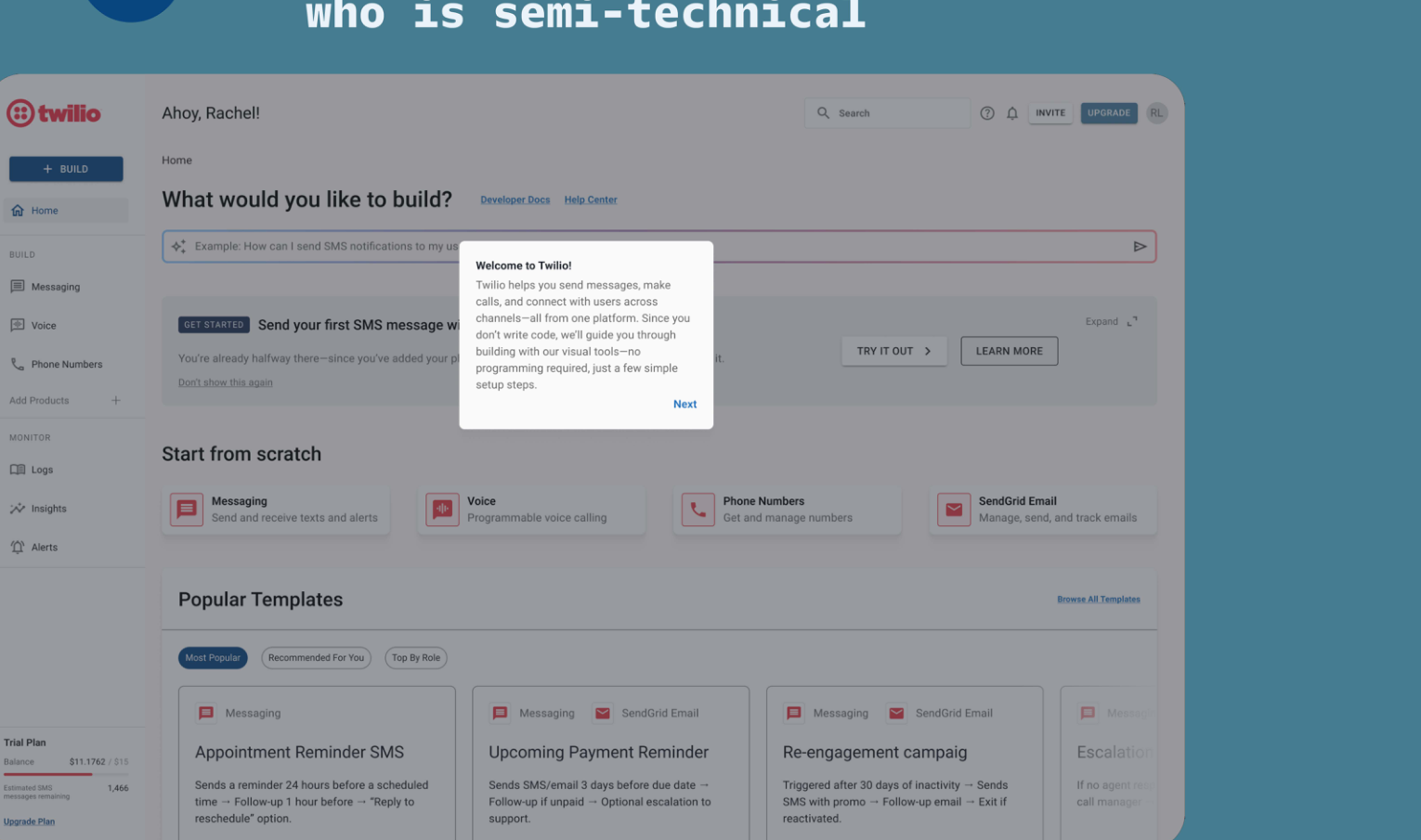
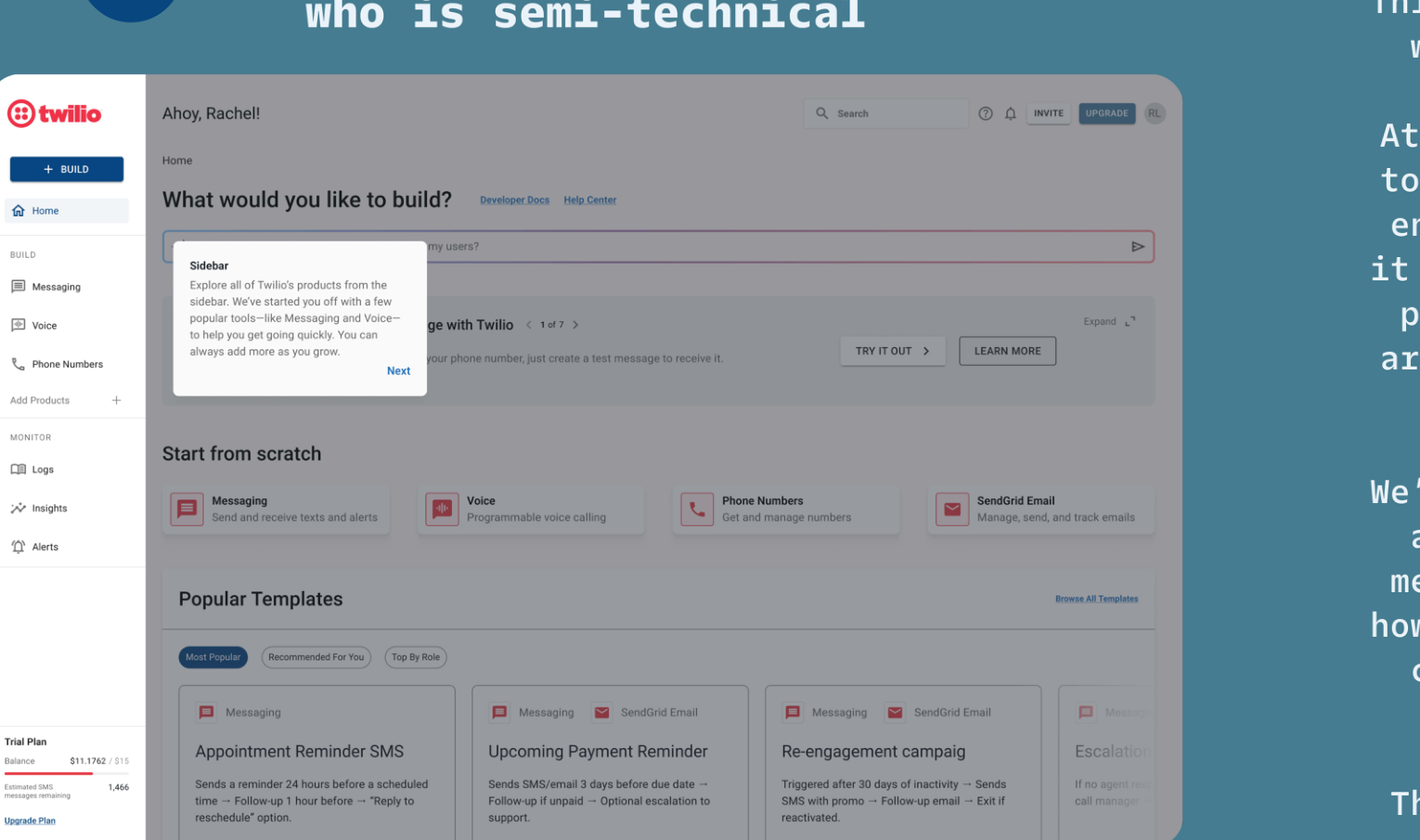
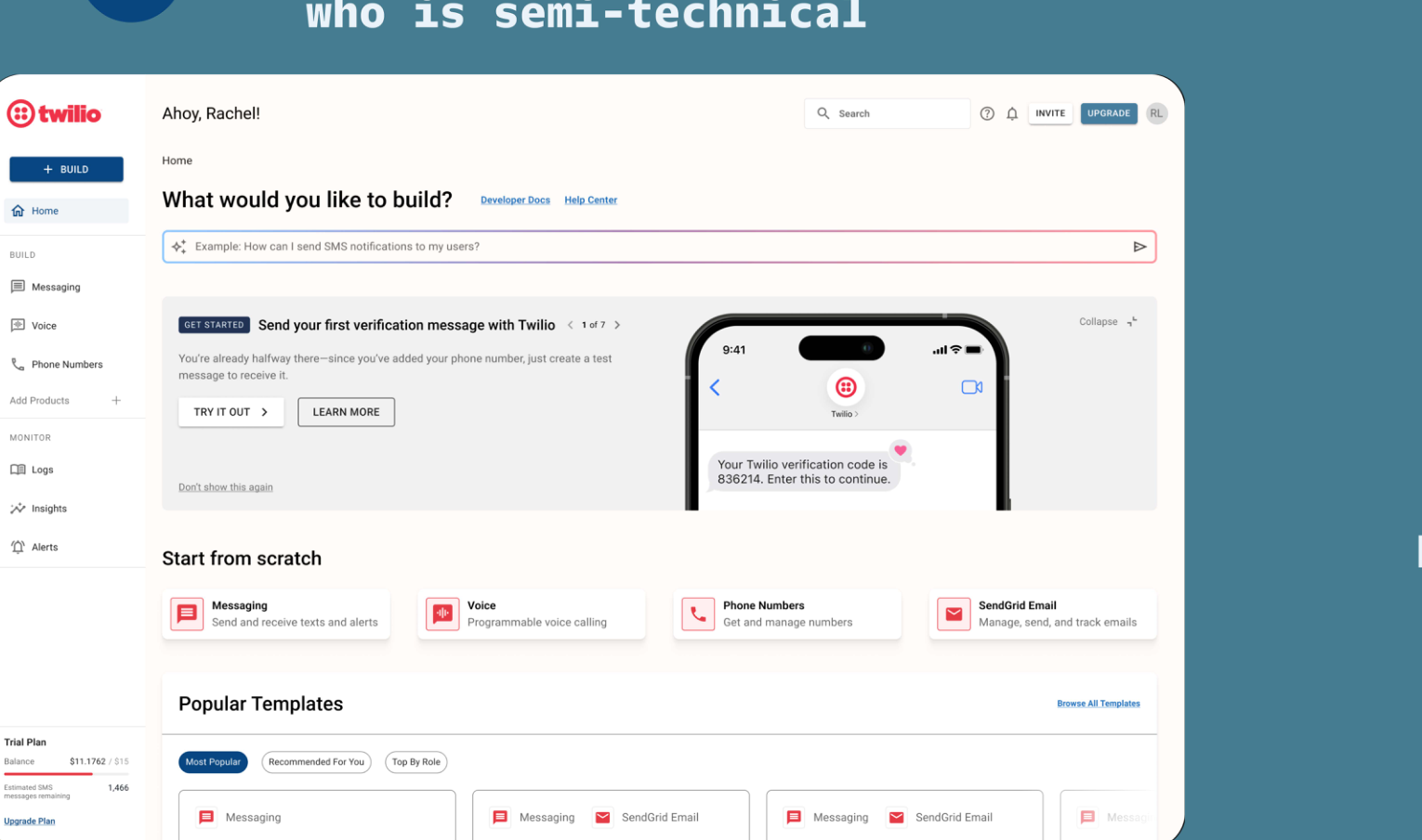
Twilio dashboard, improved version
01 · Dashboard, after. One clear call to action, one starter path per user type, and monitoring that doesn't overwhelm at the door.
Twilio messaging screen, existing
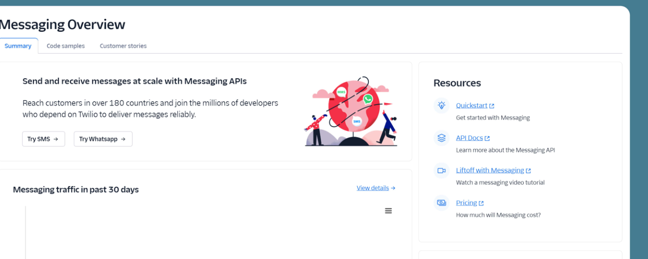
02 · Messaging, before. The messaging entry point buried its value under a wall of setup, with brand voice and product language pulling in different directions.
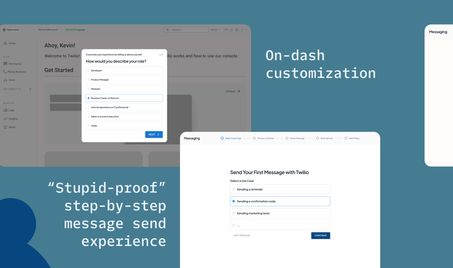
Twilio messaging screen, improved
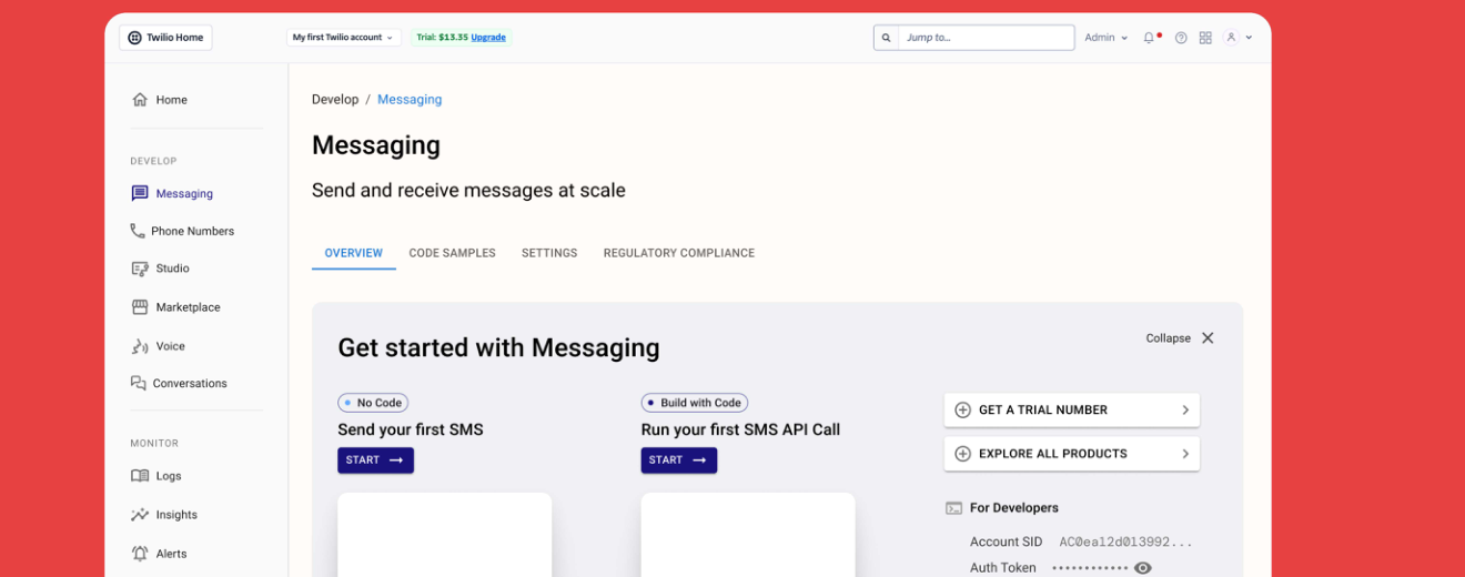
02 · Messaging, after. A shorter path to send, a clearer statement of what messaging can do, and copy that reads the same on the marketing site and inside the product.
Twilio product discovery, existing
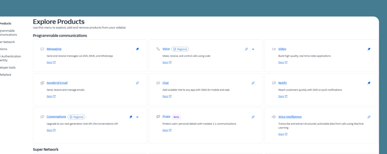
03 · Product Discovery, before. Product exploration was a maze of nested lists that assumed the reader already knew the vocabulary.
Twilio product discovery, improved
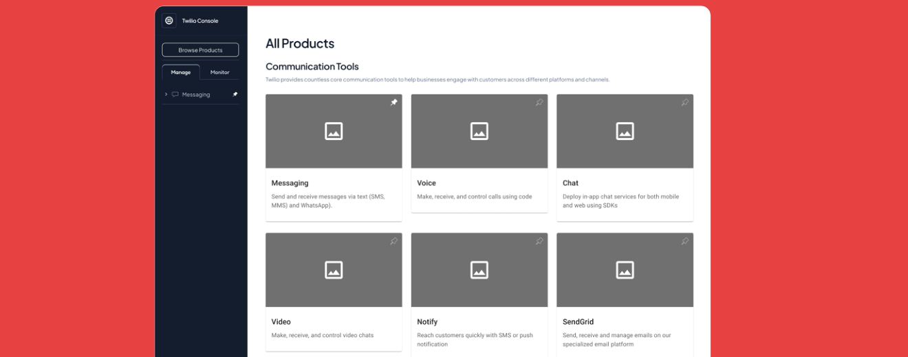
03 · Product Discovery, after. Products explained in the customer's language, grouped by job to be done, with the marketing framing carried into the product itself.
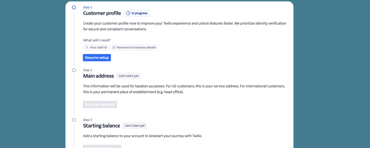
Twilio trial upgrade, existing
04 · Trial Upgrade, before. The path to a paid account leaned on the pricing surface alone, missing the value story marketing had already built.
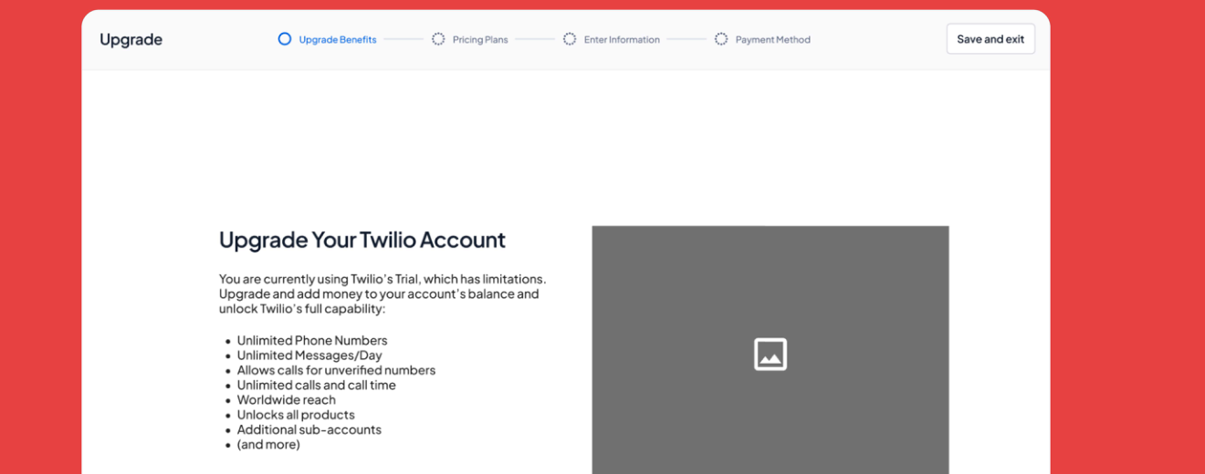
Twilio trial upgrade, improved
04 · Trial Upgrade, after. An upgrade flow that continues the brand promise, with a value narrative alongside the pricing, not the other way around.
Onboarding Flow

A first session that meets the user where they are.

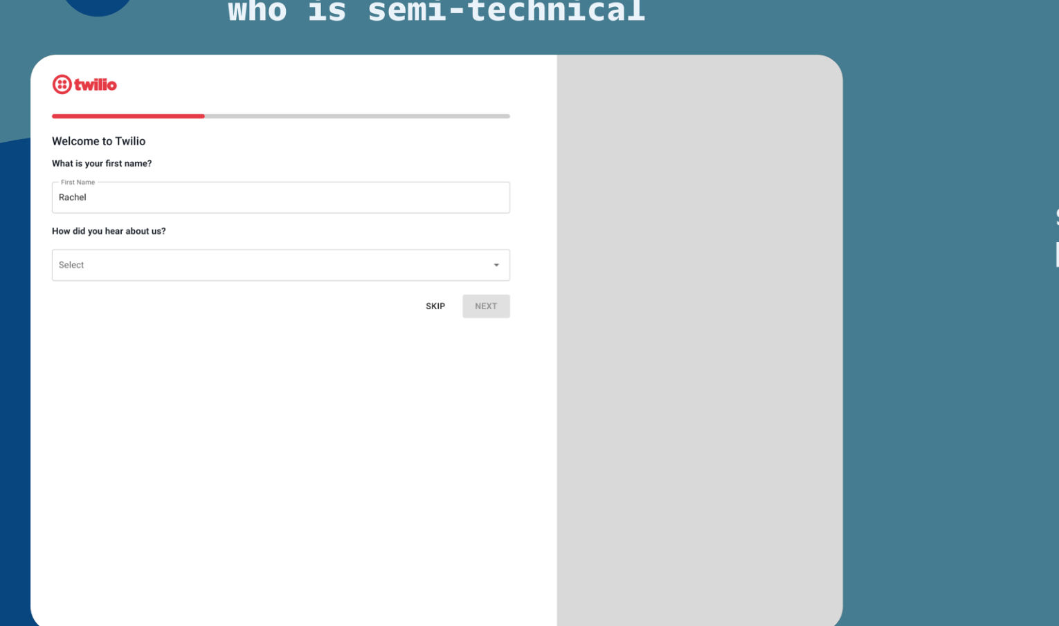
The onboarding flow was where marketing and product had the biggest opportunity to move together. The user's first eight screens across account creation, verification, workspace setup, and their first successful API call, with the marketing voice threaded through every step.
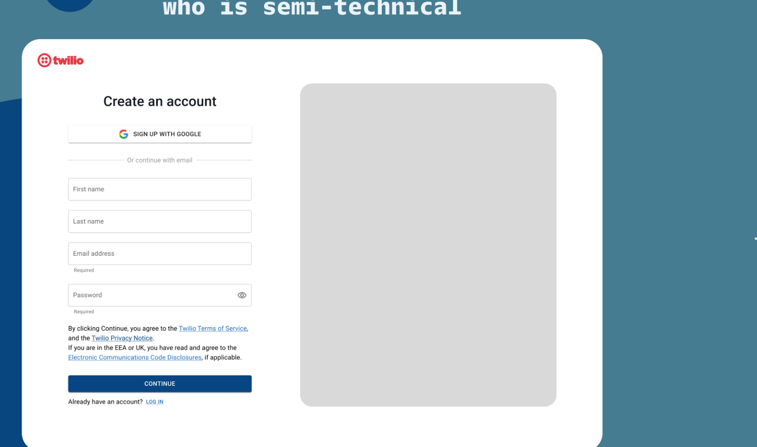
Onboarding step 1, account creation
01 · Create an account. The first screen a user sees. The placeholder on the right holds space for early value communication, a preview of what they'll build.
Onboarding step 2, verify
02 · Verify. Confirmation moved out of a modal and into the flow. Small clarity change, big drop in drop off.
Onboarding step 3, name your workspace
03 · Name your workspace. A single question that quietly signals the user is about to build something real.
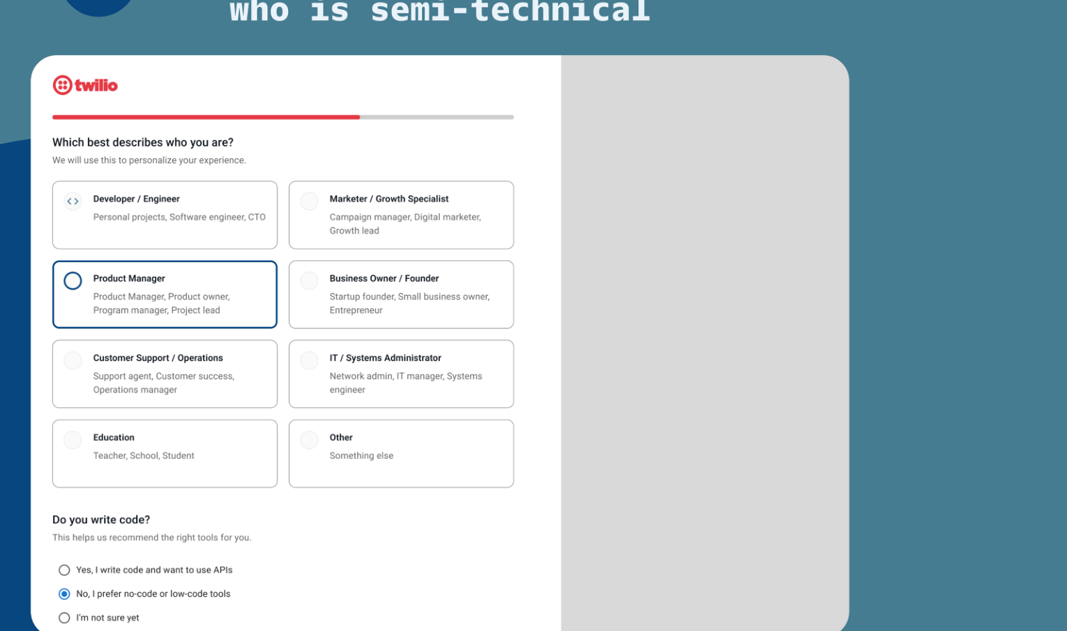
Onboarding step 4, what would you like to do first
04 · What would you like to do first? The moment onboarding gets personal. The user's choice here shapes every screen after it.
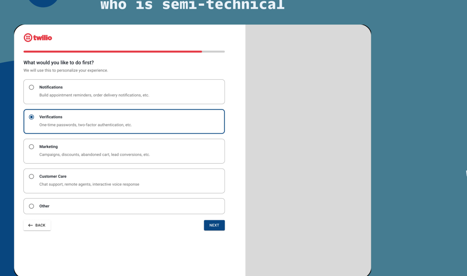
Onboarding step 5, verifications flow
05 · Verifications. A Verifications first path lands on the API a Product Manager already knows, which cuts the time to first meaningful action.
Onboarding step 6, code sample
06 · Code sample. A ready to run snippet next to plain English explanation, so both a developer and a Product Manager can see themselves in the same screen.
Onboarding step 7, integration
07 · Integration. The tool selection surface. Language sits alongside the picker so the user knows why each option matters before they pick.
Onboarding step 8, first successful call
08 · First successful call. Confirmation and the next step, in the same voice as the marketing site the user came from.
4Months, SCADPro engagement
4Core product surfaces rebuilt end to end
8Onboarding steps redrawn around one voice
1Shared brand framework for marketing and product
Elevated brand consistency and strengthened internal design systems, improving both team efficiency and user experience quality.
Impact
Tools

Figma · FigJam · Notion · Google Slides · Slack